Written By: Alyssa Ann Heller, GNP Coordinator
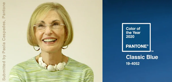
Pictured is Leatrice Eiseman, Executive Director of the Pantone Color Institute
Ever heard of a "Pantone Color"? The Pantone Color System is used across the world for calibrated color matching, whether it be in digital or physical form. For example, marketing materials are consistently printed to meet brand standards. This system is also used heavily in the design and manufacturing industries to ensure accuracy: paint colors, fabrics, and children's toys are but a few applications.
In 2000, Pantone debuted its first color-of-the-year: powdery cerulean. It was chosen to represent the new millennium as the image of tranquility and calm. Each year since then, Pantone has continued to study color trends and psychology, which ultimately influences designers and manufacturers around the globe.
"Classic Blue" is the color of the year for 2020. Leatrice Eiseman, Executive Director of the Pantone Color Institute had the following to say:
"We are living in a time that requires trust and faith. It is this kind of constancy and confidence that is expressed by PANTONE 19-4052 Classic Blue, a solid and dependable blue hue we can always rely on.
Imbued with a deep resonance, Classic Blue provides an anchoring foundation. A boundless blue evocative of the vast and infinite evening sky, Classic Blue encourages us to look beyond the obvious to expand our thinking; challenging us to think more deeply, increase our perspective and open the flow of communication."
We at Gallery Night Providence find this statement to be particularly serendipitous as it relates to our mission (and logo!) as well as the changes that we are making for our upcoming 24th season.

